2021
teccle group
Product / UI design / UX collaboration
Product Designer
At Ironhack's final project, my colleague Vivienne Pop and I were brought on to help redesign the user experience on the career page based on the corporate branding according to their values and goals by including and incorporating candidate types from all sort of career levels and expertise.
Unify the employment process of the different companies of the group and redo the user experience in a simplified way, so that applicants understand the concept of teccle and the jobs they offer.
Researcher
UI Designer
UX Design
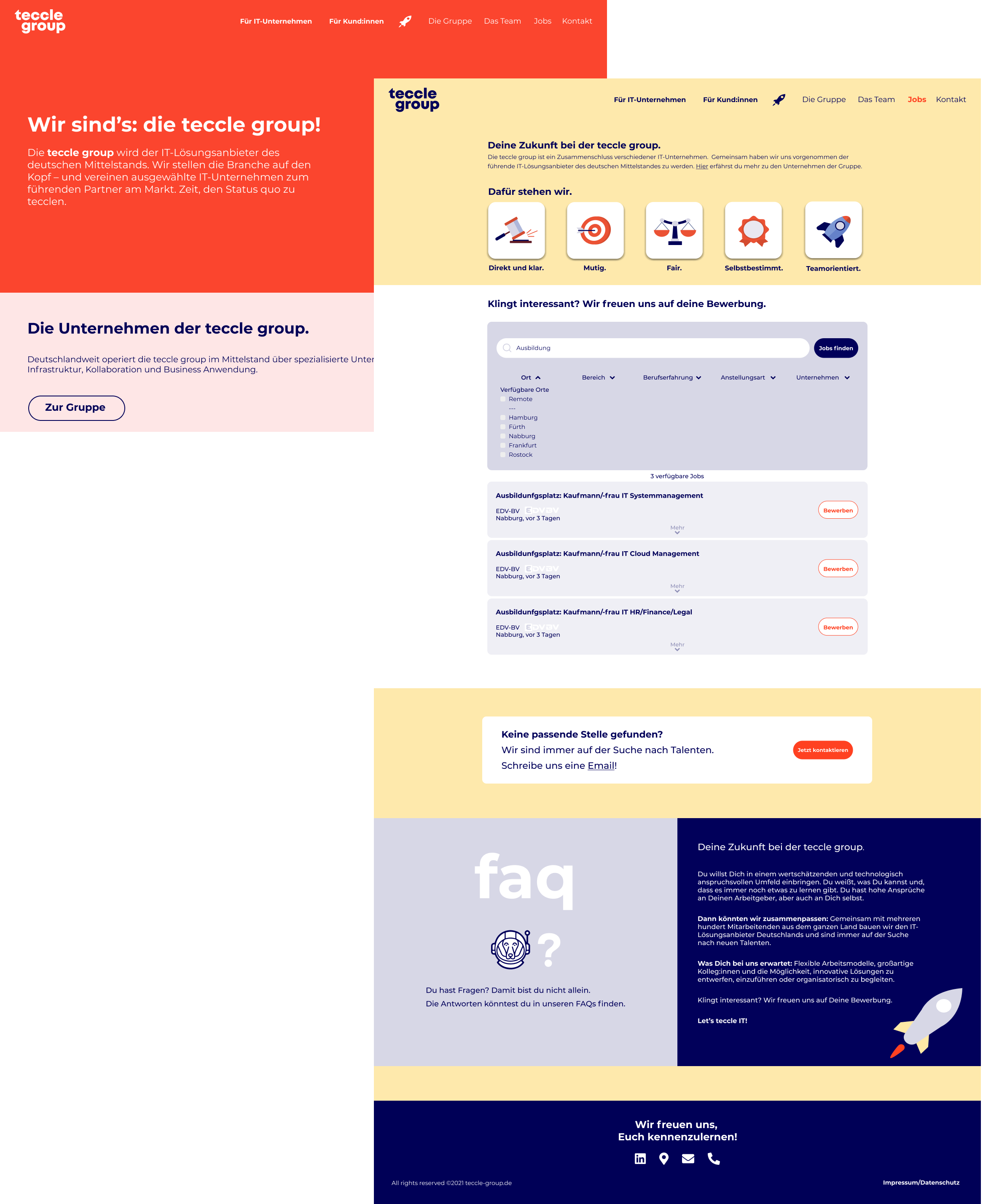
· Main issue: “Für Mitarbeitende” as a category on the menu bar is unclear as it makes reference to "Employees" instead of potencial applicants.
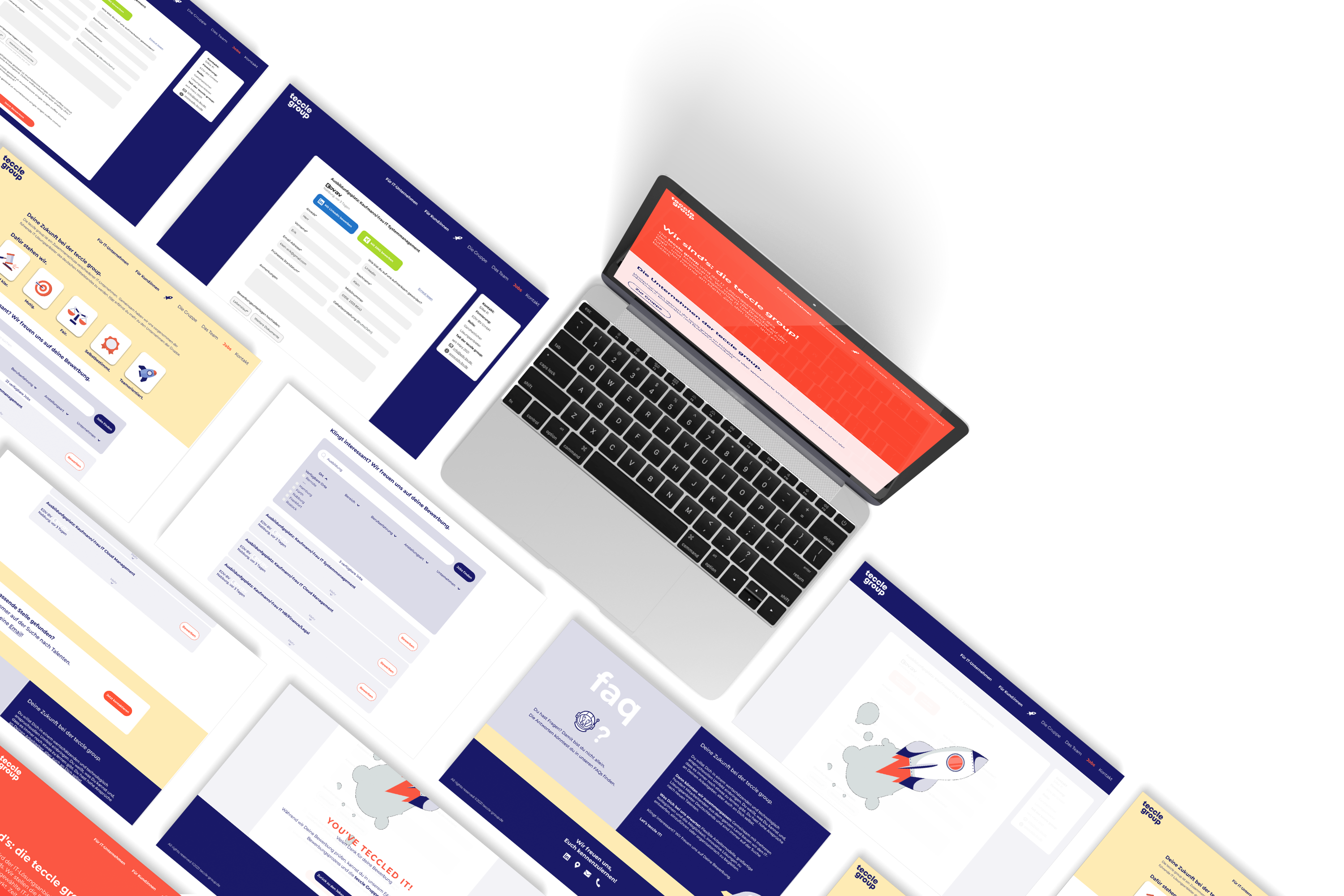
· The revised job page was designed to achieve a smooth process for job seekers. We observed that the job page is not meeting a consistent appearance, a clear application process, precise search results, quick overview or the fast submit of data therefore is causing having few applicants for open job positions and many drop their purpose half complete.
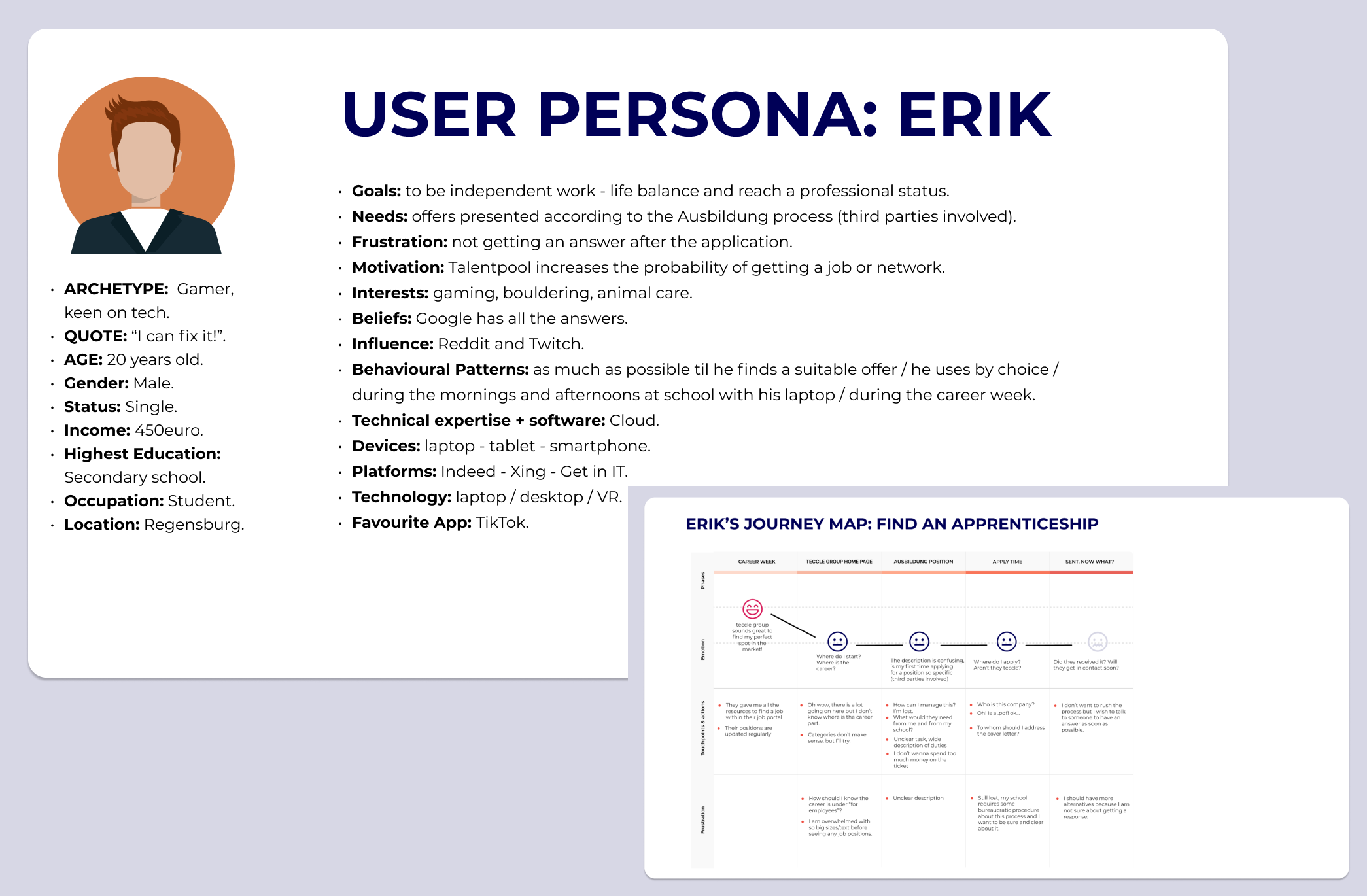
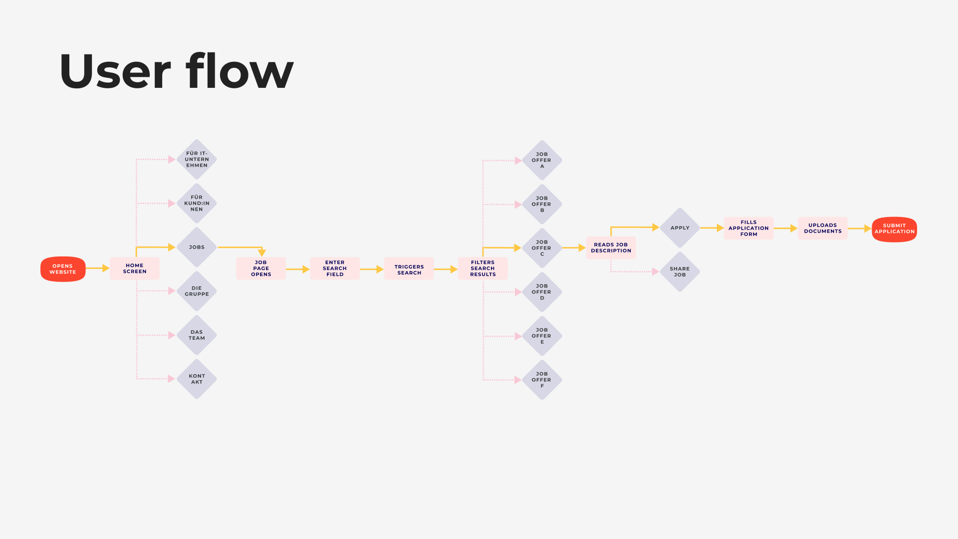
The first step we took was to conduct a visual study of teccle’s competitors to identify industry user flows. Then we proceed focused on the applicants and their experience under search and survey, usability test, user persona/scenario, journey map among other tools to identify their needs.
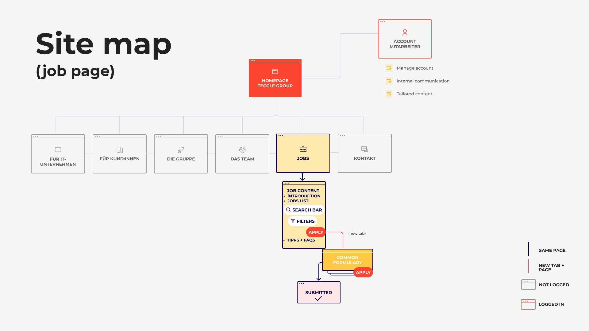
This diagram was the key to build a consistent appearance of all companies showing precise search results that allows a quick overview and enable to submit data easily.
Project scope:
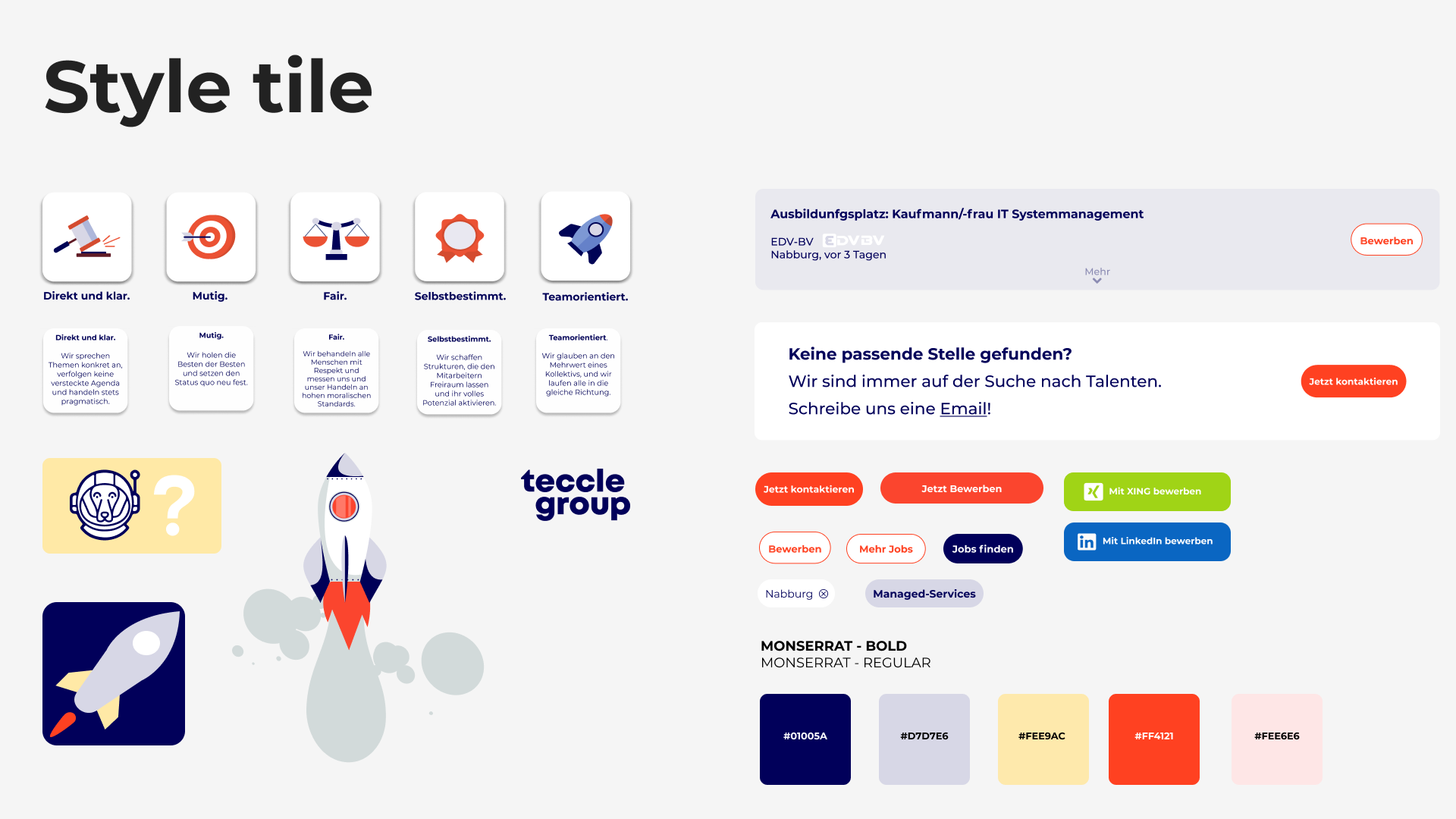
· Keep the individual design of the different brands (8 single companies).
· Follow design guidelines (color palette, typography, icons, etc.).
· Design for desktop.
· One main user flow.
· Hi-fi prototype.
· Language: German.
01
Designation for employees changed to "Jobs". Positioning this in the menu to the right side, due to the visual axis and test results of the usability test.
02
Opening the application form in a new tab allows the user to easily return to the job list and apply for more jobs.
03
Features such as auto-fill and talent pool policy to support the quick application and colaboration between the companies in the group. Also a share button to reach more applicants.
04
Values as head before job list let the user understand what teccle stands for meanwhile hover on the top of the companies's logos offers a pop up description.
For the ocassion we added a series of components and elements intended to be reused in different combinations to maintain consistency across products and teams of teccle group in the future. This are meant to be added to the original Design System.


The final design aims to build a smooth user flow for the jobseekers without leaving teccle group website and a simple understanding of the business model and it advantages in order to find the desire job opportunity.
"Jobs" is placed in the top menu as a firm solution to the initial problems. Once on the page, we see the list of jobs with an innovative system of filters, not only by manual search but also by location, companies, type of contract...
Below the list there's a box in which users who have not found the job they were looking for can submit their application to teccle. Also included for the first time is a section of FAQ and another in which the company encourages applicants to look for work through this website.
The job description is available in the job listing, while a new tab opens in the browser if the user wishes to apply for this position.
The application form is common to all companies in the group and features the job description, the company's contact information and the possibility to fill in the information with the autofill from portals such as LinkedIn and Xing. In addition, the talent pool option is included in the boxes under conditions and data protection.
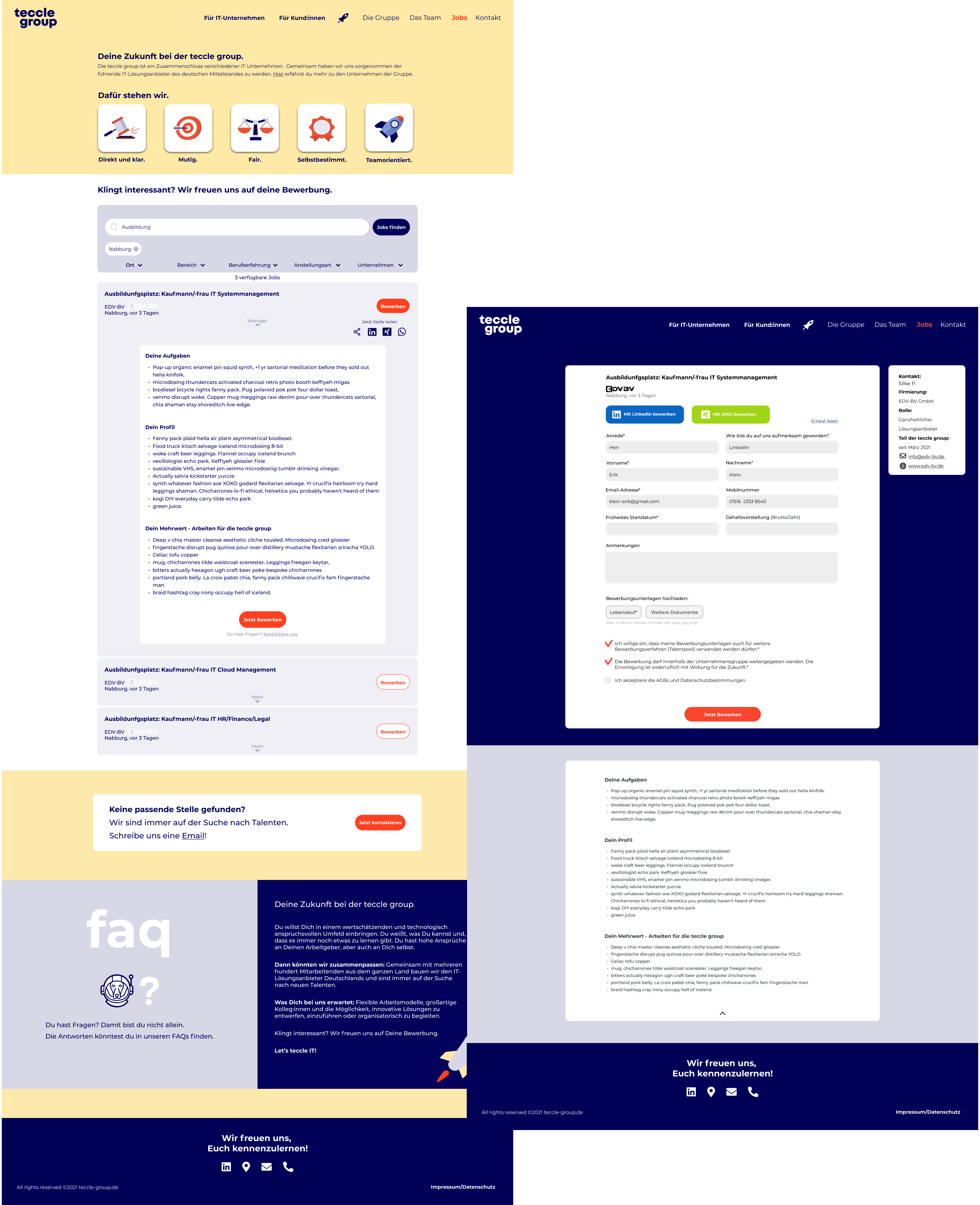
After completing the application, an animation of a rocket (a recurring image on the group's website) informs the user that everything went well and a button offers the option to return to the job board.
Succesful usability tests with high-fi prototype alongside accomplished goals. The results are a long term solution (with ability to scale).